
Category Archives: Executive Dashboards
-
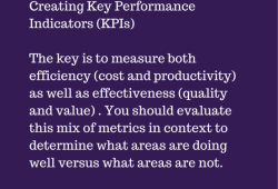
Creating Key Performance Indicators
Ever wonder how to create a key performance indicator (KPI) that are actually worth being implemented? The image below explains what we think the key. What do you think the key is? Don’t forget to check out our presentation on the 6 Key Steps In Creating Metrics That Matter
Continue Reading... -
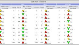
Tool Reports Are Worthless
You probably have multiple tools that are used within your organization. All those tools probably have a report of some kind but those reports are worthless when you can’t see what’s causing items to occur. Management teams don’t look at metrics/reports just to see what’s going on, they also look at reports to make positive […]
Continue Reading... -

Frosty The Tester
I thought we’d try a different kind of post today, one that deals with Frosty the Tester. Keep in mind that I’m not a musician so the song doesn’t really rhyme but I hope you still enjoy it. Frosty the tester was a happy guy with a test suite here and a script there and […]
Continue Reading... -
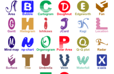
ABC’s of Chart Types
In a previous post we discussed the ABC’s of Software Metrics, which listed the various metrics that you can use throughout your project. Today we’re going to take it a step further and discuss charts & graphs. Charts & graphs are effective tools to convey information in a simple and visual way. They are also […]
Continue Reading... -
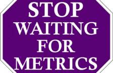
Stop Waiting For Metrics
In the past teams had to wait for reports to find out what was going on within their organizations. Are projects on time? Are projects within budget? Organizations use a variety of different tools (defect trackers, test trackers, code trackers, etc.) that are used by various teams to gather information and status on applications/projects . […]
Continue Reading... -
How To Choose The Best Chart For Your Data
There are lots of whitepapers, presentations & blogs out on the Internet that tell you to use one chart type versus another. It’s great that there are so many chart types available but do you know when to use a bar chart versus a line chart? This presentation will provide you information so the next […]
Continue Reading... -
The Good, The Bad, and The Metrics
Last week Mike Lyles & Jay Philips presented the “The Good, The Bad, and The Metrics” at STPCon Spring 2014. Below is the info from the presentation and the corresponding slides: Session Info: Has your organization ever considered replacing a tester that did not write, for example, 15 test cases per day? Is the testing […]
Continue Reading... -
Why Your Company Needs a Visual Online Dashboard
You probably hear the saying “What gets measured, gets done.” lots of times or “You can’t measure what you can’t see”. Your company probably already have tons of metrics circulating around that only focus on one area (defects, hours, etc.) but you can’t see the whole picture. How do you currently determine if your applications […]
Continue Reading... -

What CEO’s Want And Need To Know
Your organization may already have lots of metrics and dashboards but do they really have the information a CEO needs and wants to know? CEO’s want to be able to get a complete picture of progress on initiatives, goals, and projects when ever they want NOT when you can provide the information. So stop publishing […]
Continue Reading... -

7 Facts About Data Quality [Infographic]
Continue Reading...

Connect With Us
Featured In
Recent Posts
- State of Testing Survey 2016 – Announced
- Big Data Quote – Hal Varian
- Creating Key Performance Indicators
- State of Testing Survey 2015 – Open
- State of Testing Survey 2015 – Announced
