
-
ABC’s of Chart Types
In a previous post we discussed the ABC’s of Software Metrics, which listed the various metrics that you can use throughout your project. Today we’re going to take it a step further and discuss charts & graphs.
Charts & graphs are effective tools to convey information in a simple and visual way. They are also a great way to track trends and help explain complex data sets. Sometimes a line, bar or pie chart won’t cut it so below are some other types of charts/graphs that might work to tell your story.
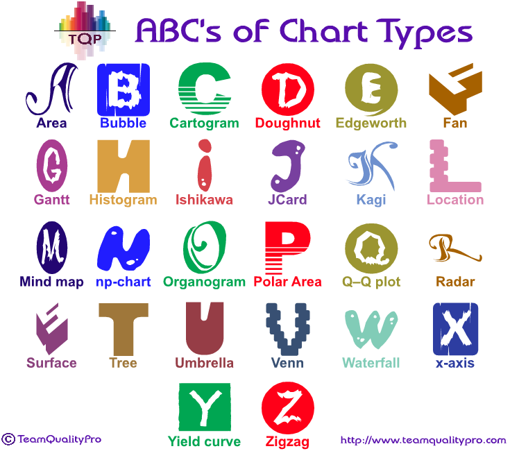
A ~ Area charts emphasize the magnitude of change over time, and can be used to draw attention to the total value across a trend.
B ~ Bubble charts are two-dimensional scatterplots where a third variable is represented by the size of the points.
C ~ Cartogram chart is a map in which some thematic mapping variable – such as travel time, population, or Gross National Product – is substituted for land area or distance
D ~ Doughnut charts show the relationship of parts to a whole, but it can contain more than one data series
E ~ Edgeworth box is a way of representing various distributions of resources, normally used in economics.
F ~ Fan chart is made of a group of dispersion fan diagrams, which may be positioned according to two categorizing dimensions
G ~ Gantt chart is used to display a series of horizontal lines showing the amount of work done in certain periods of time in relation to the amount planned for those periods.
H ~ Histogram charts can be used to display frequency.
I ~ Ishikawa diagrams (also called fishbone diagrams, herringbone diagrams, cause-and-effect diagrams, or Fishikawa) are charts that show the causes of a specific event.
J ~ JCard, created by TeamQualityPro is used to show side by side comparison of improvement. The data is shown in a table format to show data and visual icons, which allows a user to automatically see if there was an improvement or not.
K ~ Kagi chart is a time-independent stock tracking chart that attempts to minimize noise.
L ~ Location Charts (Maps) are geographical maps that show where items occur/come from
M ~ Mind map is a diagram used to visually organize information
N ~ np-chart is a type of control chart used to monitor the number of nonconforming units in a sample.
O ~ Organogram is a drawing or plan that gives the names and job titles of all the staff in an organization or department, showing how they are connected to each other
P – Polar area chart is similar to a pie chart, except sectors are equal angles and differ rather in how far each sector extends from the center of the circle
Q ~ Q–Q plot is a probability plot, which is a graphical method for comparing two probability distributions by plotting their quantities against each other
R ~ Radar charts compare the aggregate values of several data series.
S ~ Surface charts are useful when you want to find optimum combinations between two sets of data
T ~ Tree diagram is a way of representing the hierarchical nature of a structure in a graphical form
U ~ Umbrella chart can be used to show protection from, shield against, safe place, cover, overarching thought.
V ~ Venn charts are used to show overlaps between sets of data.
W ~ Waterfall charts show the net change in some amount between a starting point and end point.
X ~ x-axis is a fixed line that goes from left to right and is used for showing measurements or for finding the position of points on a graph
Y ~ Yield curve is a curve showing several yields or interest rates across different contract lengths (2 month, 2 year, 20 year, etc…) for a similar debt contract
Z ~ Zigzag (not a chart) on the line of the x- or y-axis in a line or bar graph indicating that the data being displayed do not include all of the values that exist on the number line used.There are many types of charts/graphs that can be used for presenting your data in a way that is meaningful to you and your users.
REMINDER: To choose the appropriate type of chart do the following:
1. Define what you want the chart to communicate
2. Identify the most effective chart to suit that purpose.
3. Make sure the chart is easy to understand
4. Make sure the data presented is accurate
Trackback URL for this post:
https://www.teamqualitypro.com/dashboards/bigdata-dashboards/abcs-of-chart-types/trackback/

Connect With Us
Featured In

Recent Posts
- State of Testing Survey 2016 – Announced
- Big Data Quote – Hal Varian
- Creating Key Performance Indicators
- State of Testing Survey 2015 – Open
- State of Testing Survey 2015 – Announced
